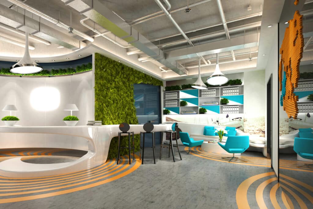
Colour Psychology Explained
Colours are a huge part of our daily lives, whether you realise it or not, so it follows that colours in the workplace can drastically affect our moods. A monotone office with only one, neutral colour has been proven to negatively impact mood, morale, and employee productivity, whereas other colours can trigger positive moods in people. The assistance of an office mood board for interior design can greatly help you to visualise colours.
Take a look at our colour wheel to see the effect each colour can have on employees, and consider adding a splash of colour to your workplace.
Office Mood Board Interior Design
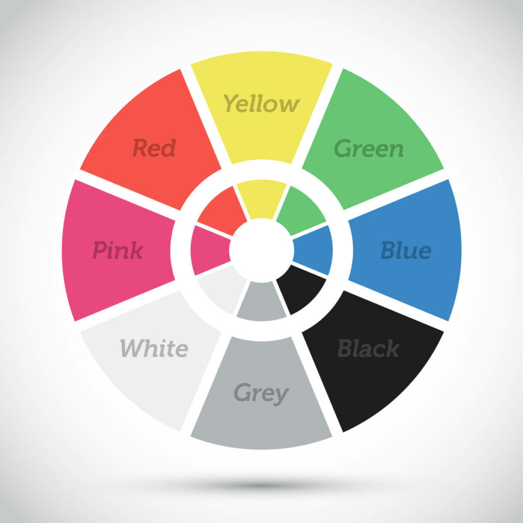
Yellow can be a great colour for energizing employees, helping to enhance concentration and enthusiasm around the workplace. However, too much of the colour yellow can have the opposite effect of fatiguing people, so using it as an accent colour is the best way of finding the perfect balance.
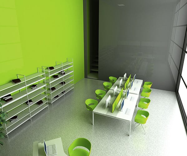
Green can create feelings of calm and relaxation, helping to reduce anxiety in employees. This is a great colour where natural lighting is not always available, adding an organic, peaceful atmosphere to the workplace ideal for a range of work environments.
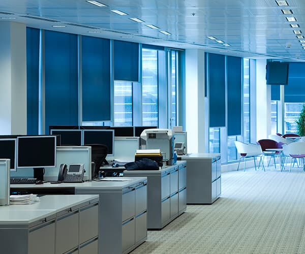
Blue has an incredibly calming influence, allowing employees to feel more relaxed and focused throughout the day. This is an ideal colour for creative workplaces, as well as medical, healthcare, technology, and IT fields.
The colour black can have a powerful impact on the workplace, signalling a company that prioritises high quality, classic branding. For a business-like atmosphere, adding black accessories to the workplace is a great way show off your values as a company.
An all-grey office can create an extremely dull atmosphere, leading to unproductivity and unhappiness in the workplace. However, in moderation, the colour grey can help to create a balanced, calm, and neutral setting for many workplaces - just make sure you add in a splash of colour, too!
A neutral white tone can be a very effective way of highlighting the brighter colours you have in place. This is a good option for environments where a professional tone is necessary, for example hospitals, medical centres, and receptions.
Pink can have an extremely calming effect on people, so is ideal for environments where a relaxed, tranquil atmosphere is encouraged. The casual atmosphere pink creates is often not suitable for a professional workplace, but could be ideal for educational environments.
Red can increase brain activity and heart rate, stimulating employees when used in the workplace effectively. However, as red can also provoke powerful feelings of anger, passion, and danger, it may not be best used as a main colour in the workplace - try using accents of red throughout the office for an eye-catching, inspiring look.
Examples of Colour Psychology In Use
- Blue
Perhaps the most famous use of blue for a company’s branding is Facebook, creating a calming, focused brand image for the company. However, interestingly enough, Mark Zuckerberg claims that the only reason Facebook is blue is because he’s red-green colorblind!
- Yellow
McDonalds are well known for the sight of the golden arches and red background, a colour scheme that is featured throughout their restaurants and branding. These two energising colours reflect the youthful, fun appeal McDonald’s try to emulate.
- Green
Groupon are known for being green. The hugely successful discount provider connects with customers via a youthful, energetic voice and green branding throughout its website and office. This colour scheme no doubt helps the creative geniuses behind Groupon’s success truly hone the voice that connects with their readers so effectively.